pacman::p_load(ggtern,plotly, tidyverse,corrplot, tidyverse, ggstatsplot, ggcorrplot,seriation, dendextend, heatmaply, tidyverse)In-class Exercise 5
Import Data
pop_data <- read_csv("data/respopagsex2000to2018_tidy.csv") Next, use the mutate() function of dplyr package to derive three new measures, namely: young, active, and old.
agpop_mutated <- pop_data %>%
  mutate(`Year` = as.character(Year))%>%
  spread(AG, Population) %>%
  mutate(YOUNG = rowSums(.[4:8]))%>%
  mutate(ACTIVE = rowSums(.[9:16]))  %>%
  mutate(OLD = rowSums(.[17:21])) %>%
  mutate(TOTAL = rowSums(.[22:24])) %>%
  filter(Year == 2018)%>%
filter(TOTAL > 0)ggtern(data=agpop_mutated,aes(x=YOUNG,y=ACTIVE, z=OLD)) +
geom_point()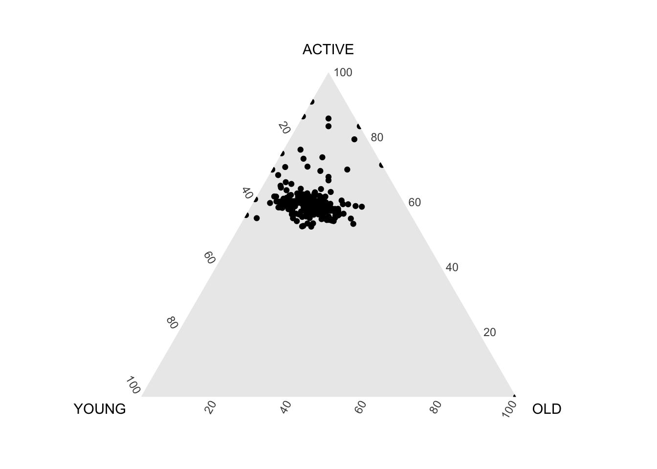
ggtern(data=agpop_mutated, aes(x=YOUNG,y=ACTIVE, z=OLD)) +
  geom_point() +
  labs(title="Population structure, 2015") +
  theme_rgbw()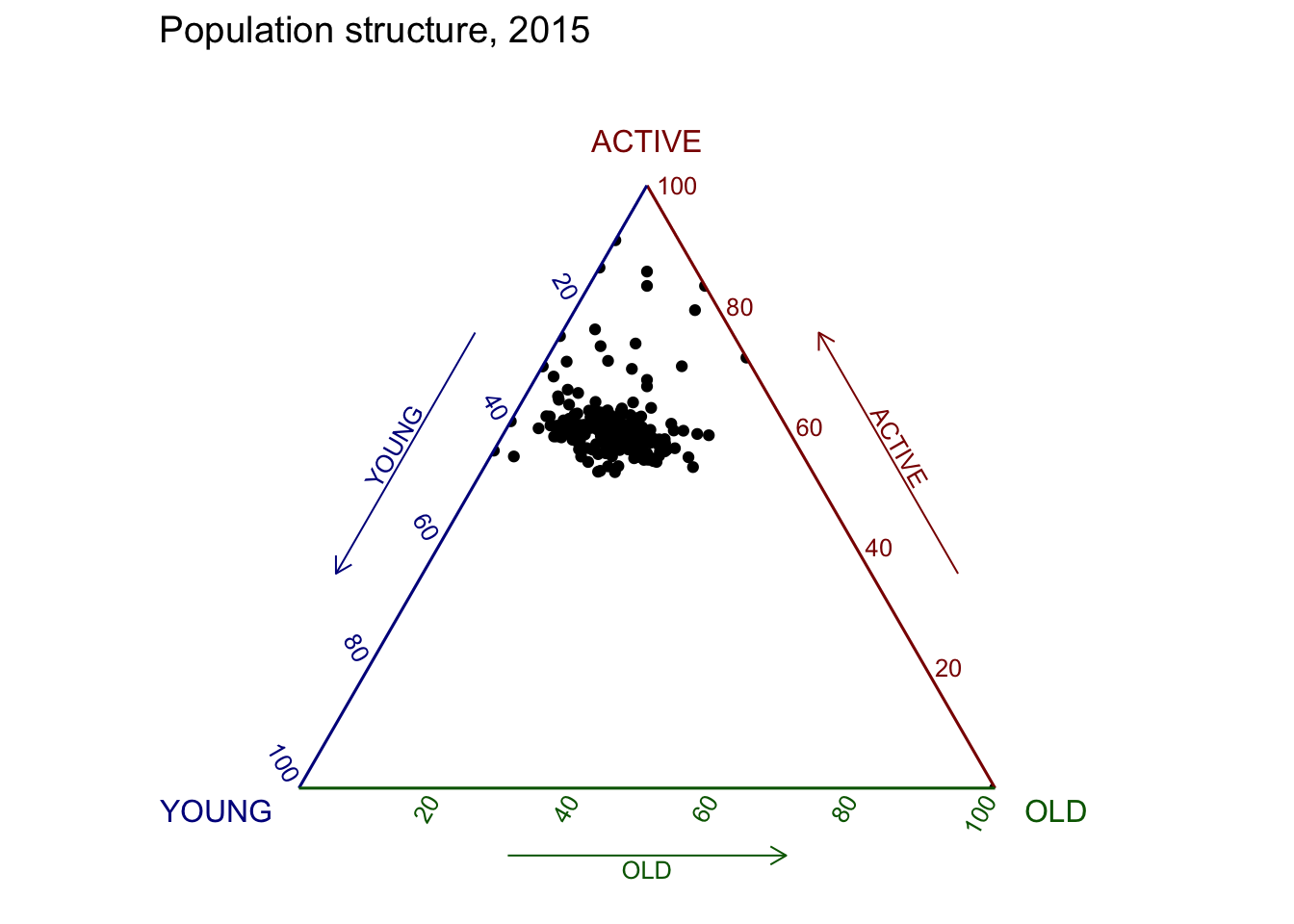
Plotting an interative ternary diagram
label <- function(txt) {
  list(
    text = txt,
    x = 0.1, y = 1,
    ax = 0, ay = 0,
    xref = "paper", yref = "paper",
    align = "center",
    font = list(family = "serif", size = 15, color = "white"),
    bgcolor = "#b3b3b3", bordercolor = "black", borderwidth = 2
  )
}

axis <- function(txt) {
  list(
    title = txt, tickformat = ".0%", tickfont = list(size = 10)
  )
}

ternaryAxes <- list(
  aaxis = axis("Young"),
  baxis = axis("Active"),
  caxis = axis("Old")
)

plot_ly(
  agpop_mutated,
  a = ~YOUNG,
  b = ~ACTIVE,
  c = ~OLD,
  color = I("black"),
  type = "scatterternary"
) %>%
  layout(
    annotations = label("Ternary Markers"),
    ternary = ternaryAxes
  )
Part 2
wine <- read_csv("data/wine_quality.csv")pairs(wine[,1:11])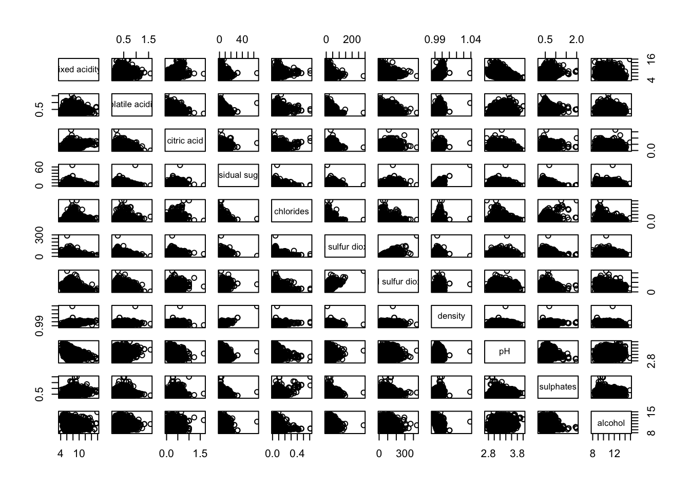
pairs(wine[,2:12])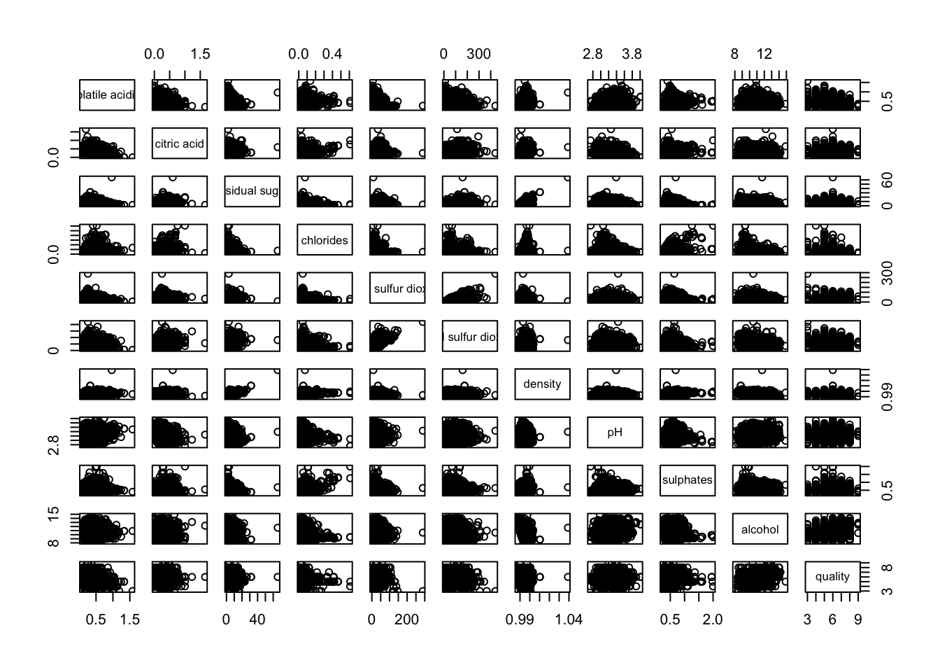
pairs(wine[,2:12], upper.panel = NULL)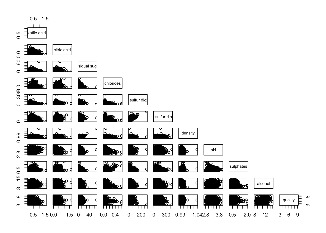
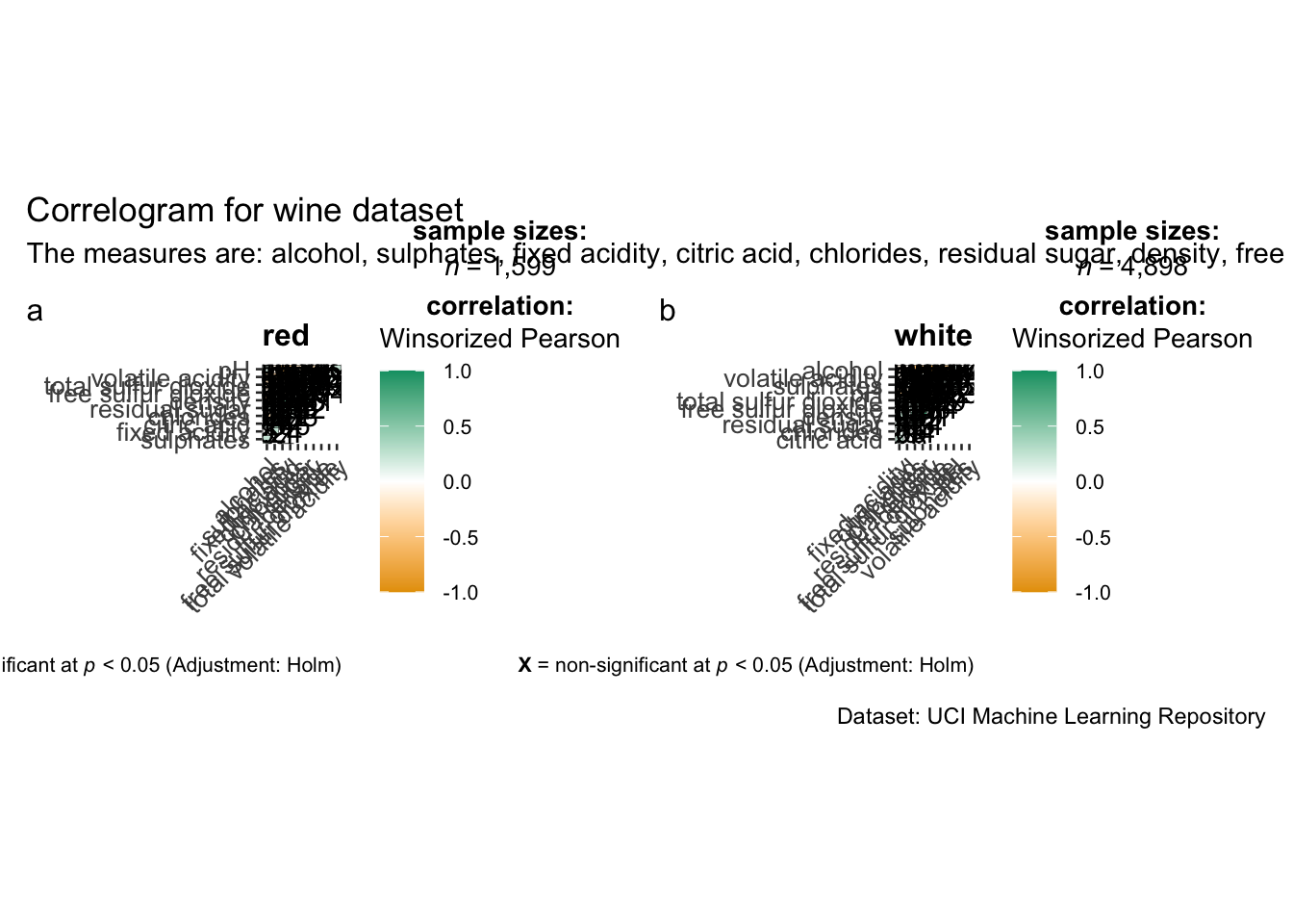
grouped_ggcorrmat(
  data = wine,
  cor.vars = 1:11,
  grouping.var = type,
  type = "robust",
  p.adjust.method = "holm",
  plotgrid.args = list(ncol = 2),
  ggcorrplot.args = list(outline.color = "black",
                         hc.order = TRUE,
                         tl.cex = 10),
  annotation.args = list(
    tag_levels = "a",
    title = "Correlogram for wine dataset",
    subtitle = "The measures are: alcohol, sulphates, fixed acidity, citric acid, chlorides, residual sugar, density, free sulfur dioxide and volatile acidity",
    caption = "Dataset: UCI Machine Learning Repository"
  )
)
wine.cor <- cor(wine[, 1:11])corrplot(wine.cor)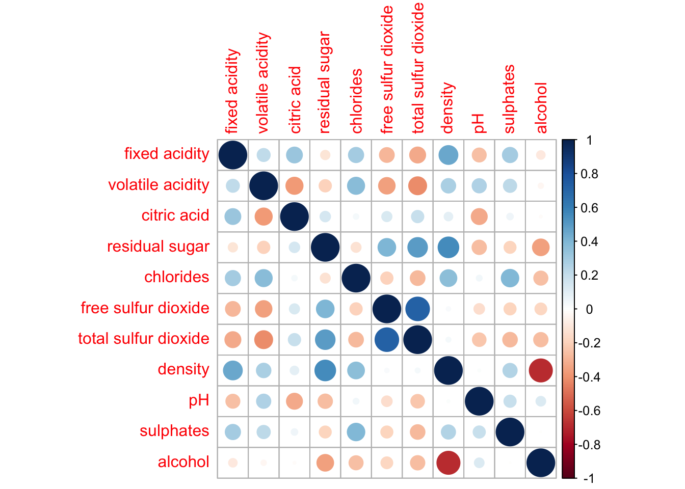
corrplot(wine.cor,
method = "ellipse") 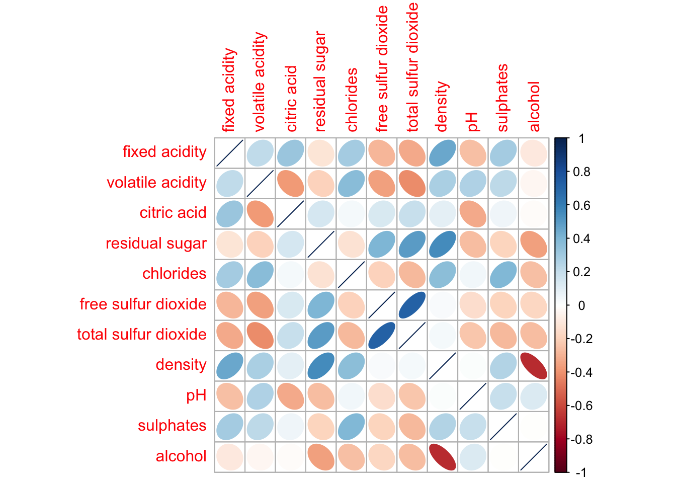
corrplot.mixed(wine.cor,
               lower = "ellipse",
               upper = "number",
               tl.pos = "lt",
               diag = "l",
               tl.col = "black")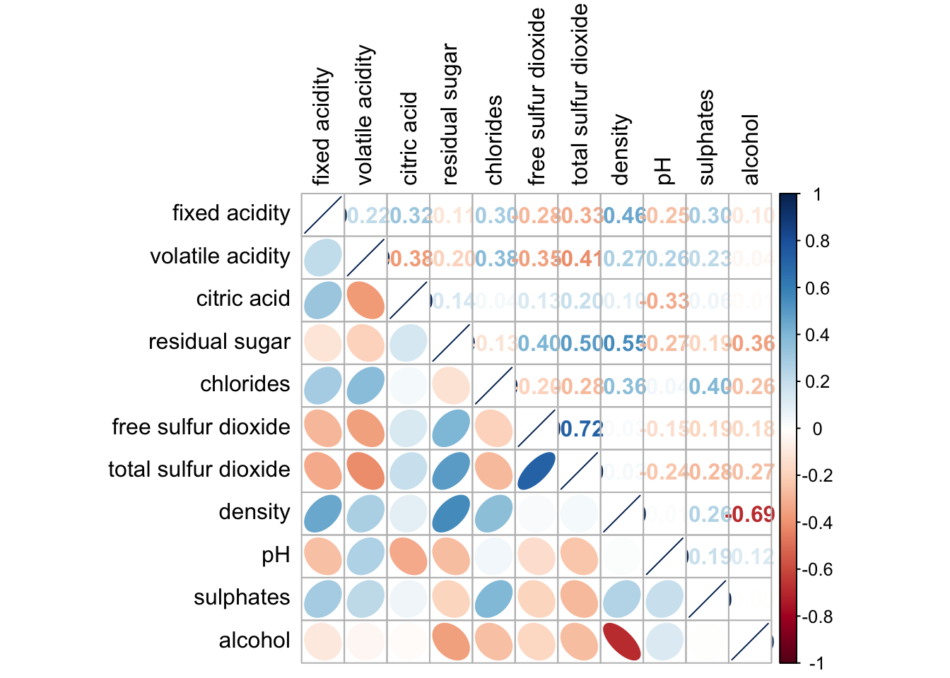
wine.sig = cor.mtest(wine.cor, conf.level= .95)corrplot(wine.cor,
method = "number",
type = "lower",
diag = FALSE,
tl.col = "black",
tl.srt = 45,
p.mat = wine.sig$p,
sig.level = .05)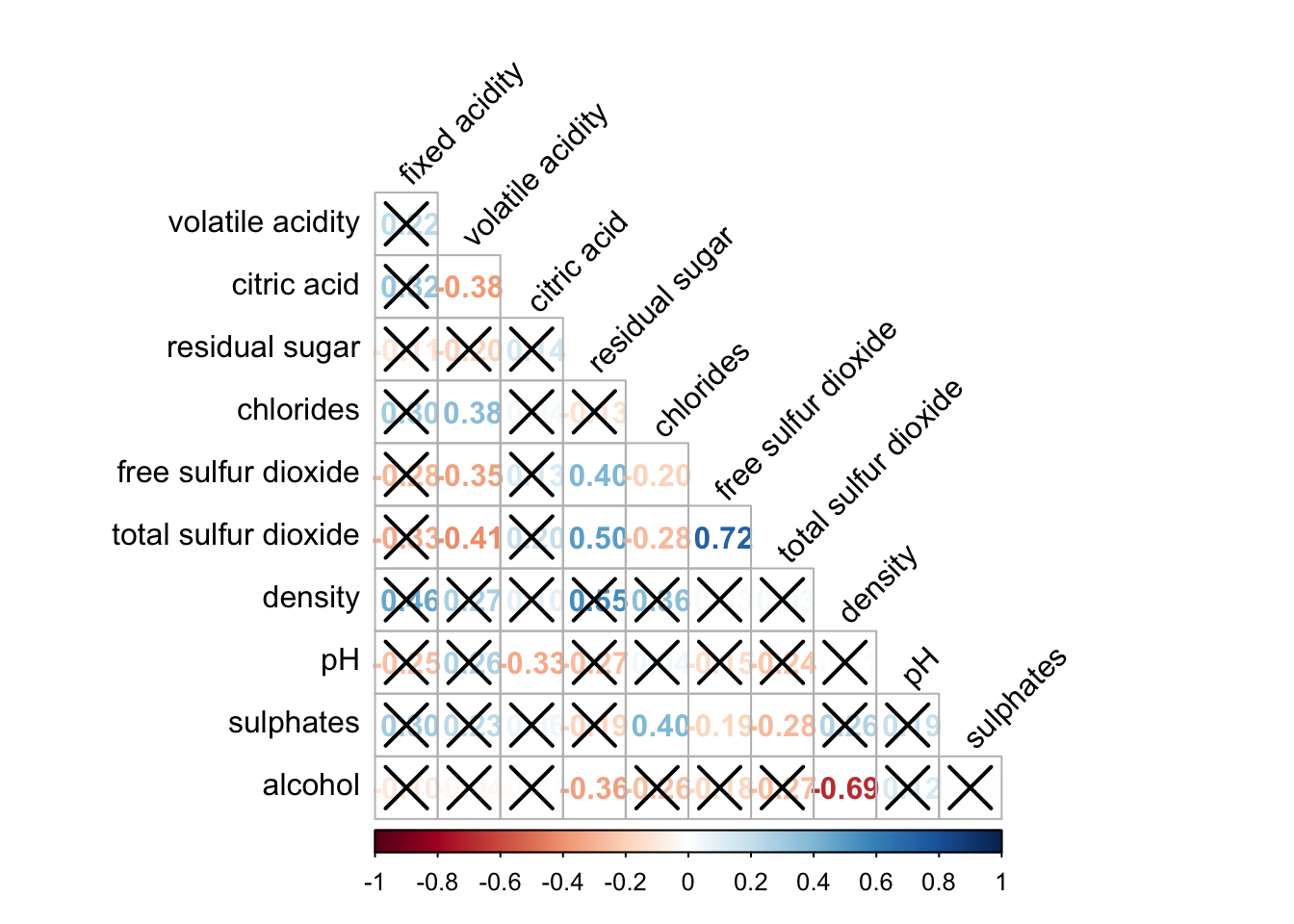
corrplot.mixed(wine.cor,
               lower = "ellipse",
               upper = "number",
               tl.pos = "lt",
               diag = "l",
               order="AOE",
               tl.col = "black")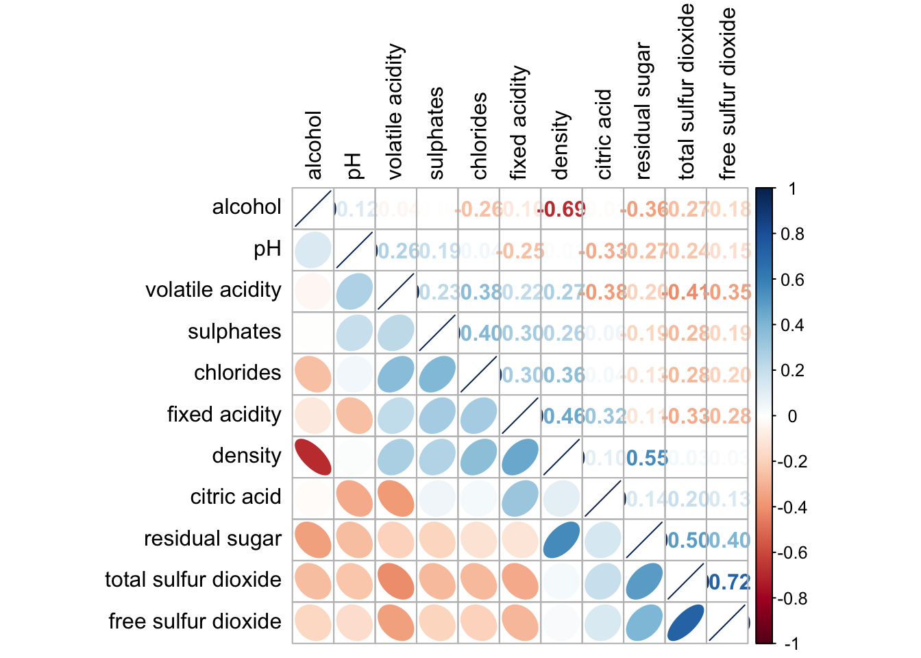
Part 3
wh <- read_csv("data/WHData-2018.csv")row.names(wh) <- wh$Countrywh1 <- dplyr::select(wh, c(3, 7:12))
wh_matrix <- data.matrix(wh)wh_heatmap <- heatmap(wh_matrix,
Rowv=NA, Colv=NA)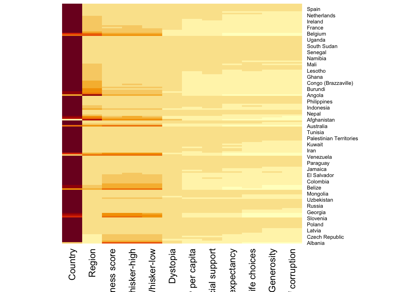
heatmaply(mtcars)heatmaply(normalize(wh_matrix[, -c(1, 2, 4, 5)]),
Colv=NA,
seriate = "none",
colors = Blues,
k_row = 5,
margins = c(NA,200,60,NA),
fontsize_row = 4,
fontsize_col = 5,
main="World Happiness Score and Variables by Country, 2018 \nDataTransformation using Normalise Method",
xlab = "World Happiness Indicators",
ylab = "World Countries"
)